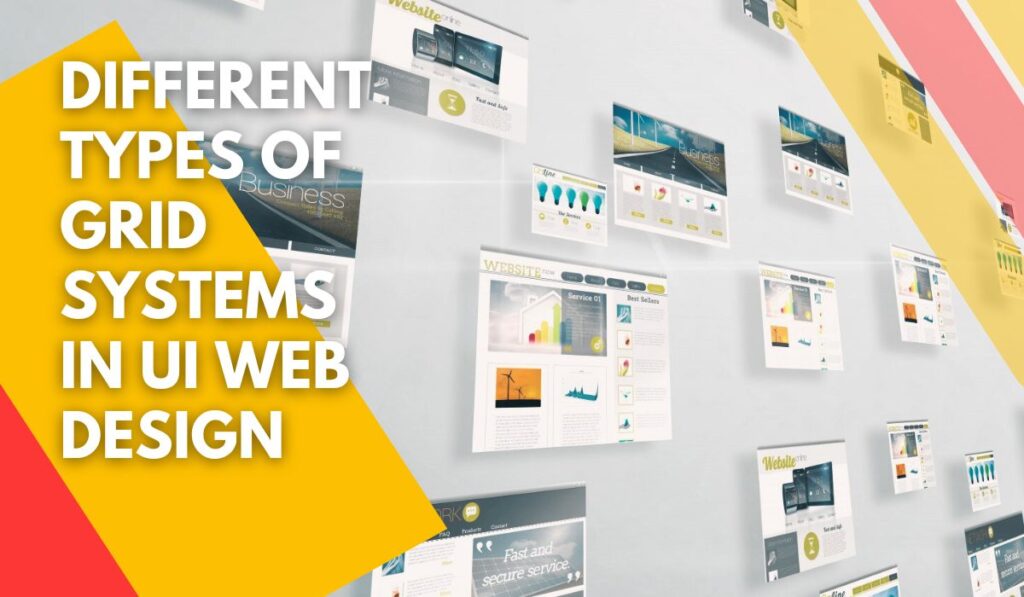
A Grid in UI web design is a system for regularizing the elements of a website and making organizations on a page. By using a grid, the position of the elements is not chancy and accidental.
The grid helps you to increase the speed of your design because, in a grid system, all elements including logos, menu items, titles, paragraphs, images, etc. have a specific and defined place on a web page.
Grid builds a structure or skeleton that makes your user interface (UI). Experts use a grid system to create and design a good user experience on a website. A web designer should know about the importance of grids in web designing and also must be familiar with the different types of grids and the critical tips for using them in a UI website design. These skills have a critical effect on a result of a web designer.
In previous articles, we spook bout the meaning and importance of grids in UI web design and become familiar with famous terms and different types of grids in UI web design.
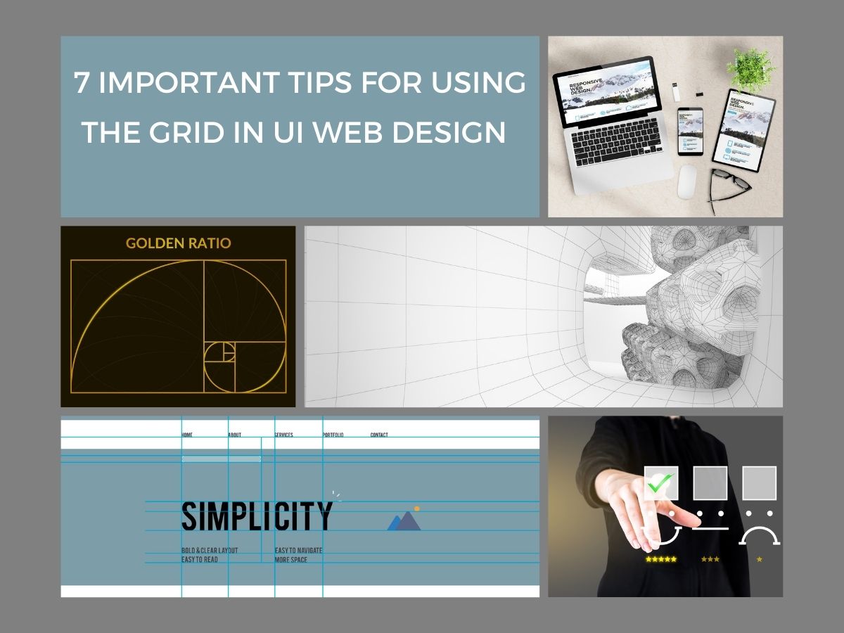
In this article, we want to speak about some of the important tips in the grid which every web designer must attend them.
➡ A podcast of this article has been provided for your listening pleasure:
[lwptoc]
1.Pay Attention To The Rule Of Thirds In The Grid For UI Web Design.

The rule of thirds is a Technic that basically can improve images, but these days, it is a very useful method in web designing. In This method, a framework is divided into 9 equal parts. It is an imaginary and mental division.
An important question for a web designer is what is the best place for putting elements in a framework.
The research backs it up that the centre of a framework induces a prosaic feel. In addition, researches show that people are attracted to the top third of a framework involuntarily. So, web designers usually set the main content on the top third of the framework.
On the basic page of a website, the position of the fundamental elements such as advertisements, icons of social media, banners, etc. is on the top third of the page. Web designers also use this rule for designing internal pages. they usually place important images and attractive concepts on the top third of internal pages. In this way, they can attract viewers to basic content.
The researchers also back it up that when people see a framework, they are attracted to four points of it involuntarily. These points are located in four corners of a frame and the most important of them is placed in the top left corner of a frame. The elements that are placed in this location, are more pleasing to the eyes of viewers. Web designers use this rule for designing a UI website. They usually set the logo or slogan of a website on the top left corner of the frame.
However, the ruler of the third isn’t a necessity for web designing, but it helps you to make a good grid system for designing the elements of the website. It’s a good technique for designers who want to use an asymmetric grid for web designing.
2. Think About A Responsive Web Design Grid.

In responsive web designing, you work with unfixed measures in the grid. Web designers try to define ratios and preparations that are appropriate for different devices such as a tablet, desktop cellphones, etc. It means by changing the size of the monitors and browsers, the measures will be changed but the ratios will be fixed. So, when you are making a grid for designing a website, you must consider ratios.
3. Attend To White and Negative Spaces In The Grid.

White spaces play an important role in the details of design such as legibility of content, the hierarchy of information, breathing space, etc. Due to the importance of white space in setting the elements in the web design, it is a very important factor in a grid.
White space plays an important role same as columns and rows in the grid. You must consider about width and length of white space for example if you define an 8 pt. Scale for columns and rows in a grid, you must define an 8 PT scale for white spaces too.
4. Regard To The Golden Ratio Fibonacci In The Grid.

Ratio Fibonacci is used for improving the size and balance of the grid by web designers. Ratio Fibonacci is defined as a Golden Square whose length is 1.6180 times its wide.
For example, if the width of the framework is 100 pixels, its length will be 161.80 Pixels. This golden ratio is used for designing and setting various images and contents on a framework. By using this ratio designers can measure the necessary space for every element by dividing it to separate parts.
5. Heed To The User Experience for Selecting A Template.

A simple symmetric grid for designing a template induces a sense of comfort in viewers. But be careful that your simple templates don’t cause your viewers to feel bored.
So, sometimes you can design your website without a grid and change the size of a specific element for emphasizing to them. For example, you can unite several columns and create visual attractivity. But be careful that if you break the grid exceeding, you will destroy the template. In addition exceeding emphasis on different elements will cause the viewers don’t attend to any elements.
6. Using A Grid Is Not A Limitation.

Some designers believe that the grid makes limitations on their design. It’s wrong but sometimes you can design without the grid. but you must know when you can do it. we suggest, if you are a beginner web designer, always use the grid. The grid creates balance among the various elements of the website, it helps you to regularize your content based on the hierarchy and you can tidy your template based on UI principles.
However grid makes some limitations for the web designer, but this limitation can direct their decisions to the correct path. This kind of limitation is good for beginners because it helps them to attend to balance.
7. Grid Helps You To Build A Mind Map.

The grid can help you to build a mind map and a mental model from your website and every page of it. It helps you have consistency on different pages of your website, it means that different pages will have harmony.
Sometimes you have to lay a lot of content on your website, in this situation, a grid helps you not only to place various content on a page but also to save the harmony and consistency of your website. In this situation, the grid directs viewers to the goals and users can find their requests on your website easily. It will cause a good user experience and have a positive effect on your SEO and ranking.
Conclusion
In this article you found out the 7 important tips for using grid in UI web design which you must consider about them, including attending to the rule of thirds in UI web design, thinking about a responsive web design, attending to White and negative spaces in the grid, regarding the golden ratio Fibonacci, heeding to the user experience for selecting a template, using a grid is not limitation, and the grid helps you to build a mind map.