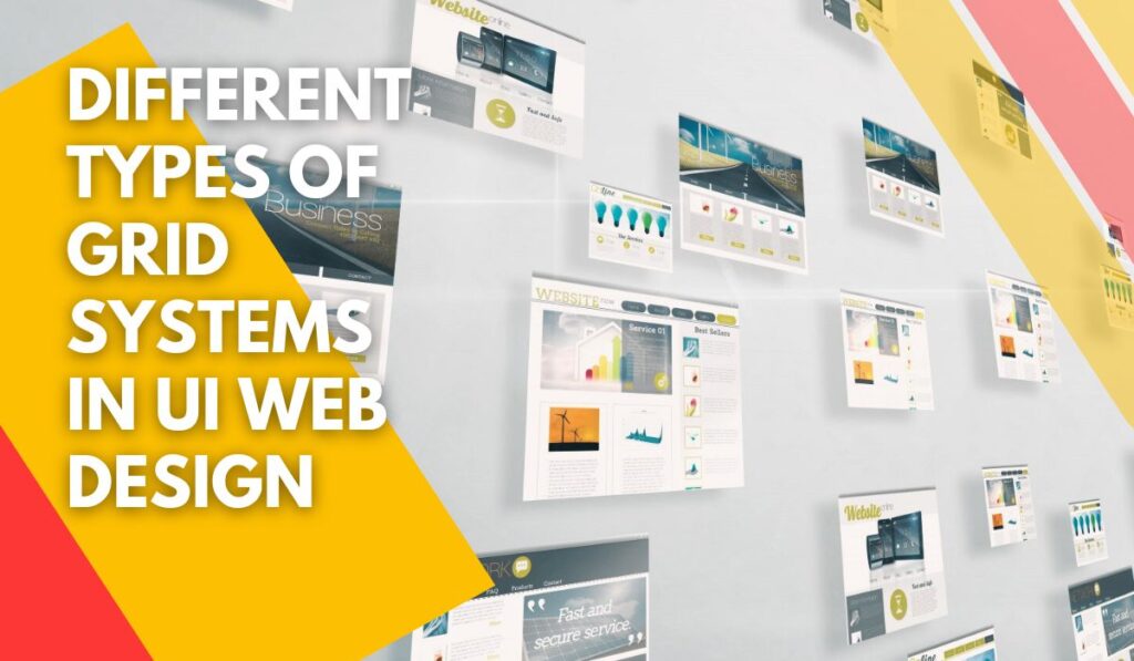
Web designing is growing. Every day it improves and new factors are added to it, but some factors play important roles in UI website design. Because of the importance of user interface in website design, the ultimate goal for every web designer is that users can easily find their requests on a website.
The main objective of every web designer is correctly transferring information to users. For this purpose, web designers must be used a grid system. The grid helps them to transfer information to the user in the correct way.
In previous articles, you found out about the meaning of the grid and its importance. in addition, you became familiar with common terms in a grid system. In this article, we will speak about the different types of grid systems. After reading it, you will find out which kind of grid system is appropriate for your website. So, join us to know more about the different types of grid systems.
➡ A podcast of this article has been provided for your listening pleasure:
[lwptoc]
Classic Or Block Grid System

it’s the simplest type of grid in UI web design. It’s defined as one column or b block that the text content and images are put on. It’s also called a writing grid. It’s just a column that includes text content and images put inside it. It is also determined by a border. The images in this kind of grid system are always complete and big.
A classic grid system is usually used for weblogs, books, and articles. It is appropriate for every content with a narrative concept. In this kind of content, web designers want users to attract and read long text and its attractive images. So classic grid with a vertical and Central arrangement helps viewers accept to keep reading.
Module grid

In this kind of grid system, you must arrange different and various elements. We use module grids on pages like image galleries, downloading files, work samples, and other paid that have a lot of different content and are the same as a collection. Another important paid that usually use this kind of grid is keeping pages for example article keeping pages.
Hierarchical grid

In this kind of grid system, there are not any symmetric or equal divisions. Web designers may use a different size for creating a dynamic design on a website. He/she tries to highlight some parts of the website.
There isn’t any defined principle for determining the size and proportion of elements. The important tip for using a hierarchical grid is you should have a logical and rational reason for selecting a small or big part. The design of elements must be logical. You can use this grid system for showing the concepts like freedom and creativity on your page.
Column grid

In this grid system, web designers use several equal columns on a page. The column grid system is usually used for pages that have several parts with equal value and different concepts. For example, you can use three columns for introducing 3 products. These products are different together but they have equal value and no one is outstanding from orders. So, for avoiding confusing users and becoming absent-minded, you must use of column grid system with equal and symmetric columns.
The number of columns is completely dependent on the designer. But using 3, 4 and 12 columns is very common and popular among web designers. In this part of the article, we want to speak about different column grids types.
12-Column Grid

It’s a very useful Common and flexible grit system. Why? Because it can be divided into 3, 4 or 6 columns. So, it’s very flexible and you can easily organize various concepts in this type of grid. In addition, you can make both symmetrical and asymmetrical designs with this great. So, you can design dynamic beautiful templates.
4 Columns Grid

The benefit and advantage of using four columns great system is simplicity, balanced and confirmation of this grid. The most disadvantage of four columns grid system is very symmetrical and may cause reviewers to feel tedious.
Web designers usually allocate a column for the main content, and other columns are earmarked for minor and subordinate content. You can Imagine the first column for branding, the second and third columns for the main continent, and the last column for minor content.
3 Columns Grid

In this kind of grid, every column has 4 units, so, it is an asymmetrical grid system. Therefore, when you use this grid, you need to be very creative to make a balance in your Design. Since web designers use this great less than others. However, an asymmetrical design is more dynamic than symmetrical types but designing a racial asymmetrical grid is very difficult.
6 columns grid

In this kind of grid system, every column has only 2 units. Because there are a few number units in every column, working with it is more difficult than 3 columns grid system. But it will prepare more footing for details.
If you want to design a website with deep content and you must place a lot of details and information on the website, 6 column grid is a good grid system for you. Please pay attention that if you are a beginner in web designing, working with this system is very difficult and we don’t suggest it.
Compound Grid System

you as a web designer can compound different grid systems together. In this situation, 12 columns grid system is very useful because it can easily compound 3, 4 and 6 columns grid systems together. For example, you can define the first row with four columns, the second row with three columns and the last row with two columns. In this situation, you will have 3 rows template.
Conclusion
For designing a website based on the principles of user interface (UI), you must design your content based on a regulation on your website. Designing a website with a rational skeleton and structure is the first step in attracting users. For this purpose, the grid system is the best tool for putting the elements regularly.
With grid systems, viewers will be attended to specific options and will be guided to determine links and pages, which will have a good result in your busyness. So, you must attend to a beautiful simple grid system. There are different grid systems including classic, Module, hierarchical and column grid systems. In addition, the column grid system is divided into 3, 4,6, 12, and compound grid systems.