
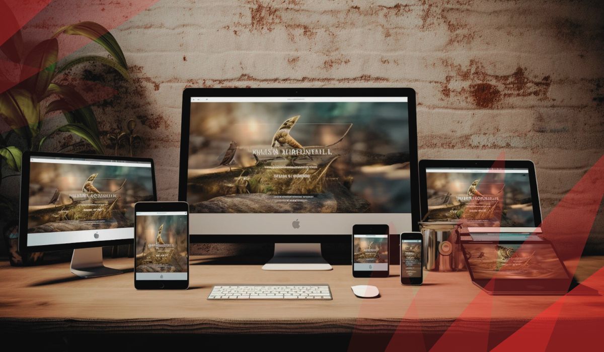
If you want to improve your online business, undoubtedly you must think about a responsive website. A responsive website is very important for attracting more users to your digital marketing. Nowadays most users are searching on search engines on their smart cellphones.
So, designing a website that can be adopted and optimized on various devices including mobile and laptops. In this situation, all users will have a good user experience in your online business. In addition, it can make great traffic to your website.
Therefore the SEO of your website will be improved and you can gain a good ranking on google. So, users can see you on top of the google result page. It means that you can get ahead of your competitors and earn more money.
so, read this article to know more about the fundamental techniques of designing a responsive website including Fluid grids, Fluid images, and Media queries. If you are a beginner in the world of web designing, we suggest you keep reading this article.
In addition, if you want to find out more information about a responsive website design and its importance, we suggest you click here.
➡ A podcast of this article has been provided for your listening pleasure:
[lwptoc]
What is The Meaning Of The Responsive Web Design?
The meaning of a responsive website is designing a website so that its elements can respond and adapt to all various devices whit different sizes of monitors such as desktops, cellphones, laptops and tablets.
So, one of the important principles of designing a responsive website is flexibility for various devices. Therefore, all elements of a responsive website must be flexible for adapting to different devices. So, you as a web designer must try to find the best ways and techniques for designing a responsive website.
However, there are a lot of methods for designing a responsive website, but three techniques are the basics of responsive web design. So, keep reading to be familiar with them.
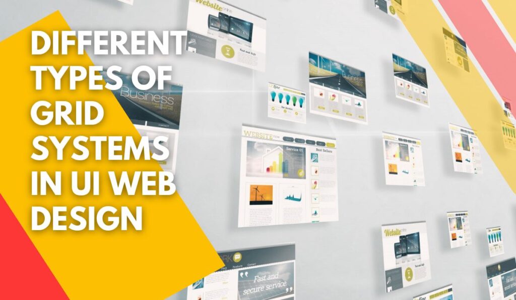
The Three Fundamental Techniques for Designing A Responsive Website

Nowadays, the methods for designing a responsive web are improved and a lot of ways are presented. But, there are three basic and main technics for designing a responsive website. In this article, you can find out useful information about these three fundamental techniques in UI responsive web design.
However, every webmaster and web designer based on his/her project can use the other techniques too. If you want to know about the other principles of designing a responsive website, please click here.
1. Fluid Grids

There are different elements on every page of a website, including images, texts, etc. The position of these elements on the page is one of the important parts of web design. It has a huge effect on the attractiveness and legibility of a page. It also can encourage users to keep reading your website or cause them to leave it.
In web design vocabulary, the grid is defined as a set of columns and rows that determine the structure of different parts of a website for a web designer. In addition, containers are determined inside the grid for putting various elements.
There are different systems for building a grid on a web page. No matter which system is selected and used by a web designer, he/she has to work with size and measure.
Now let’s speak about the role of grids on a responsive website. The important question for every web designer is how he/she can adjust the size of various elements of a web page such as fonts, paragraphs, images, etc., on different devices including desktops and mobile.
Web designers usually use various units to define and determine the size of elements of a web page, for example, pixel, percentage, etc. An important tip for designing a responsive website is never to use a fixed unit for making a grid.
A web designer has to use ratios or proportions instead of fixed units such as pixels. In addition after determining a ratio for the page’s elements, a web designer must change the ratio to percentage to make grit for a web page.
For example when you want to put a specific element on a web page, first you must measure the ratio of the container of the element and then change this proportion to a percentage.
2. Fluid Image

Every picture on a web page has a specific size. Web designers have to think about the factors that can affect the size of a picture before putting it on a page. It’s very important in designing a responsive website because in a responsive website images can get small or big depending on the size of the monitor of various devices.
It is the meaning of the fluid image. There are different methods for designing a responsive fluid image for a website. One of the most famous ways is defining a specific CSS code for every image on a page. You can see the CSS code for designing a fluid image in the following:
img { max-width: 100%; }
In this technics, the designer defines a maximum width for every image, in other words, the width of an image is determined as 100% instead of fit size. It means that the width of every image is 100% of the width of its browser. So when the wideness of the browser gets increases or decreases, the wideness of the image will be adapted it.
3. Media Query

Media query is the most important technique in designing a responsive website in CSS. This ability is defined in CSS2 and is improved in css3.
This technique help designers test the characters of various devices by the media@ in CSS. After doing this test, designers can determine a specific code for every element based on the result of the test including the wide, height and viewport of every device.
A viewport is defined as the part of a page that users can see it. For example, imagine that the laptop’s viewport is 800 pixels, Designer tries to write a CSS code for it based on the wide, height, and resolution of the device as in the following:
@media screen and (min-width: 800px) {
.container {
margin: 1em 2em;
}
Conclusion
Designing a responsive website is a critical method for attracting a lot of users to a website. Previous people usually use desktops for searching on search engines like google but nowadays, most users prefer to use their mobiles (especially cellphones) for this purpose.
So if a website is not responsive, it will lose a lot of traffic and it hurts its SEO and Google ranking. In this article, we show you three fundamental technics for designing a responsive UI website including Fluid grids, Fluid images, and Media queries.