
Having a responsive website is a part of improving your digital marketing. Because it can increase the traffic to your website and user experience. Both of them have a critical effect on the SEO site and Google ranking. When your website gains a good grade from Google, it will be on the top of the Google search result, so more people become aware of you.
Our expert team in the Chidma Company are here to help you for designing a functional, handsome responsive template for your website. We present you a collection of 70 free downloaded impressive responsive templates. Click here and enjoy them.
Take note that after designing a responsive website by using every template, you have to check some critical factors of it. So, join us in following to find out pro tips that you must consider on your responsive website. our professional counsellor will be near you along this way, by clicking here.
➡ A podcast of this article has been provided for your listening pleasure:
[lwptoc]
1. The Resolution Of A Responsive Website: Checking It On Various Devices.

As you know, a responsive website has to adjust on various devices including desktops, cellphones, tablets, and laptops. It means that all its elements must have a good representation on different sizes of monitors.
One of the important elements that you must check on different devices, is the resolution of your website. If the resolution of your website on various devices not be optimized, it will harm the user experience. So, it will decrease the traffic to your website.
You can easily check the resolution of your website on different devices. There is no need to use complex and different tools for this purpose. There are Some free online tools for doing it including. For this purpose, click here to find out more about it.
2. Checking The Navigation Of A Responsive Website.

The menu bar is one of the important parts of the navigation of your responsive website that presents the content of your website to users. But sometimes, decreasing the size of the monitor can make some problems in its presentation. however, all responsive templates that are designed by the expert team of…company had been checked before publishing, but if you design your responsive template yourself, there are 3 steps for checking its menu bar, including:
• Check all of the visual elements of your bar
• Check the submenu and be assured that they have a good presentation on your website. In essence, they must be flexible on your responsive website.
• Make sure the content of the list and menu are legible.
3. Checking The Quality and Flexibility Of The Images.

Images are one of the important elements for making good communication between your website and users. So, improving the images is very important for designing a responsive website because they play a role in your brand and help it to become well-known.
The provisional web designers of the Chidma company suggest pro tips improve the images of a responsive website:
• Use images with high resolution in different sizes of a monitor, in such a way that by changing the size of the monitors on various devices, viewers still see the images well. It will cause them to have a good user experience on your responsive website.
• Select an appropriate format for your images. Always save your images in JPG or PNG formats. If you use a flat method for designing your website and you don’t want to use effects and Shadows for icons, we suggest you use vectors instead of images.
• You can also improve the images with bitmap format on your website.
• Use low-size images whit high quality. There are some free online websites such as tinypng.com and compressing peg that you can use for reducing the size of images without decreasing their quality.
4. Creating Legible Contacts for A Responsive Website.

The experts always emphasize that the legibility of content is a critical factor in designing a responsive website, so, you must pay attention to it. Take note that changing the size of your website doesn’t have any effect on the legibility of your content. Hence, they consider three tips for creating legible content:
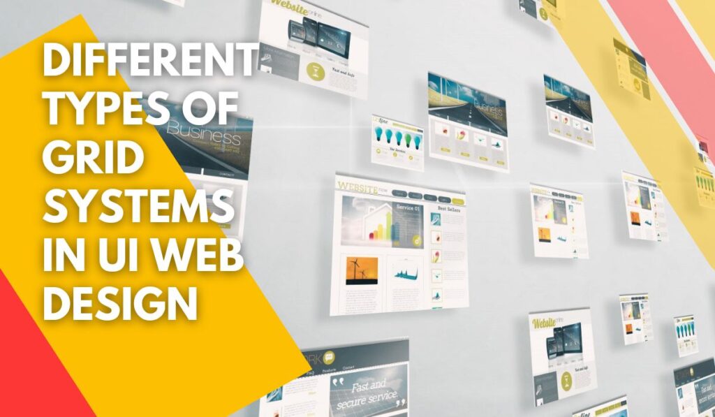
• Making a template for your content based on the standard principles of a grid format.
• Use the titles in the correct positions.
• Select appropriate professional templates with a lot of ability for presenting your content. How? Click here to find them.
If you want to experience designing a template for your website, we can help you to make a professional grid system on your template. Click here to confer with us.
5. Check The Function Of Some Elements Of Your Website On Various Devices.

Take note of the function of Some elements on your responsive website including buttons, formats, list and menu and all of the links with the ability for clicking. You must check all of them and make sure that they work correctly on various devices.
6. Design Appropriate Navigation for Your Responsive Website.

Navigation is one of the important parts of designing a responsive website. Navigation has an important effect on user experience. it helps users to move easily from one page to other pages of your website. Changes in the size of the website may cause some problems with navigation. So, check it on various devices before lunch on your website.
7. Avoid The Inconvenience Of Pop-Ups

However, pop-up windows can increase the traffic to your responsive website, they also can cause inconvenience for users. So, be sure that their positions on your responsive website are flexible on various devices.
8. Consider The Loading Speed Of Your Responsive Website.

The loading speed of a website has an important effect on the SEO site. Because it is directly related to the user experience. So, our expert web design team in the Chidma company, always try to control all factors that harm the loading speed of a website. You can find some notice in the following:
• Improve images and videos and try to use low-size images and videos with high quality.
• Use of the cache plugin of a browser.
• Confer with a professional counsellor in the Chidma Company.
9. Improve The Typography Of Your Responsive Website

The typography of your website is including the elements like the size and type of font, spacing between lines, spacing between the title and the first line of the paragraphs, etc.
In a responsive website, typography is very important because you must be careful about the size of the font and other elements and be sure that they are appropriate and legible on various devices including mobile and desktops.
The expert web designer of the Chidma Company believes that using the web fonts such as Yekan and Dinar is more beautiful for your website than the use of system fonts such as Tahoma.
But you must know that the web fonts will decrease the loading speed of your website. conferring with professional web designers can help you to make the correct decision. So, click here to help you.
10. Select A Simple Glamorous Responsive Template.

You must know that using simple responsive templates will have to increase the loading speed of your website. if your template is simple and attractive your viewers will have a good user experience because they can see your website quickly and completely. You can find a handsome collection of extremely functional templates on our website. Click here and enjoy them.
11. Check The Template Of Your Responsive Website On Search Engines After Designing It.

Your responsive website should be adjusted on various devices. Hence, you must check it by using some free online tools. They can help you to see the appearance of your website on various devices or determine the size of the monitors.
If you want to know about the free online tools for Checking your responsive website, we suggest you read our article about 9 important ways for checking your responsive website.
Conclusion
Designing a responsive website is very important for increasing the traffic to your website. After designing a responsive website, you must check some factors on it. These factors can affect the user experience of your website. hence, we show you 11 pro tips about checking a responsive website.