
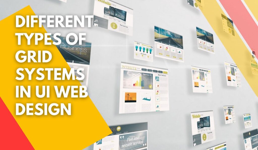
Designing a website based on the user interface (UI) is one of the critical factors that every web designer should consider about it. One of the important tools that can help designers to design a UI website with a rational organized structure, is a grid system.
In this article, we will speak about the importance of using a grid system for designing a website and we will present a clear definition of a grid system and its common terms. So, join us to be familiar with the grid system in UI website design.
➡ A podcast of this article has been provided for your listening pleasure:
[lwptoc]
The Meaning Of Grid In UI Website Design

Grids are horizontal and vertical lines for organizing pages that you want to design them. The grid system helps you to organize, level and adornment all of the elements of your page based on the successive columns and rows. In the other words, grid systems prepare a simple structure and create an appropriate skeleton for designing a page.
Web designers always use this structure for placing and setting texts, paragraphs, images and other elements of a page in determining places. Every element has its specific position on a page, so, by using a grid we can find the elements of the page easily. In addition, we can easily change the place of elements based on the grids.
Grids are like Superman; they always help you to design the structure of your website based on UI principles, and then, at the end of the process of web designing, the grid gets disappeared and the user never can see superman.
The Importance Of Grid In Web Design.

If you even don’t find out why you need to use a grid for web designing, a grid will help you to create an adornment and concordant design. If you are an expert in designing, never try to show up your ability by designing a complex sketch for a website.
Designing a website without any symmetric and balance will cause viewers to think it is a higgledy-piggledy website, so, they never trust it and they will leave your website quickly. It will hurt the SEO and ranking of your website on search engines like Google.
There is a rule: balance is always attractive. Grids cause the user attract to the simplicity and symmetric of your website. So, they decide to stay on your website and read your content.
Some web designers believe that grids are a kind of limitation. But it’s wrong. The grid is a tool that helps designers to meet their real objectives. Grids play as a guide for the web designer. So, he/she feels confident about the UI of his/ her design. When a design has a balanced structure, viewers will feel it is an organized website and can trust it.
Common Terms Of The Grid In UI Web Design.

1. Column:
A column is a vertical part of a page that the content will be set inside it. So, columns make the blocks of a grid system. Columns of a page may be different in numbers, length, and width. But in a standard plan, the number of columns is 12 on desktops, 8 on the tablet, and 4 on cell phones.
However, designers determine the wide of columns themselves, but in most grid systems, the wide of columns is different from 60 to 80 px. The wide of a column has a critical effect on the wide of your content. In addition, there is a unique option for the column; there is a direct relationship between the number of columns and the flexibility of a grid system.
2. Row:
Rows are horizontal parts of the content. They are less important in UI web design than other elements such as a column.
3. Module:
modules are placed at the intersection of columns and rows. They create units in a grid system. Most modules are defined in square patterns. Modules are related to all of the elements on a page including texts, images, buttons, etc.
4. Unit:
it’s defined as the primary blocks of a grid system. Several units can make a grid together. If imagine a network of lines, a vertical column can be a unit.
5. Gutter:
gutters are lines between columns and rows that separate these units from each other. The role of the Gutter is to create negative space between columns and rows. It is one of the important parts of the paneling of layouts of a website. The wide of the Gutter is important and the common wide is 20 px.
6. Margin:
it’s defined as negative space between the framework or panel and outside of content. Margin is like a gutter but it is placed out of the plan. There is a difference between the size of the margin on desktop and mobile. Most times it is determined as 20-30 px for mobile.
7. Field:
The field is a part of the horizontal division of a page. Several columns can create a field. It’s better that you try to design a field with an equal length until the end of the page.
How To Use Grid System In UI Web Design.

A grid System help to organize the elements of a page base on constant columns and rows. When you have this symmetric structure, you can easily put and set all of the elements of your web design on the page including texts, images, etc. regularly.
A grid system incus defined specific units for measuring, by using these units, you can easily determine the size, space and other regulations in your Design.
Conclusion
Designing a website based on the principles of user interface (UI) is very critical for making successful digital marketing. The first view that the user will take on the website, is its structure of it. Designing a UI website with a rational skeleton and structure is the first step in attracting users.
One of the important tools that help web designers, is a grid system. Since the importance of grid systems in web designing, using them is increasing. Nowadays, various and different principles and standards are defined for it. A Grid system can be defined as a guideline for web designers. It can ensure designers that the users will have a positive user experience from the structure of their websites.
Not only a grid system is not a limitation for designers, but also, it’s a tool that helps web designer to meet their objectives easily. However, users cannot see the grid system, it has a lot of benefits for them. A grid system helps them to find queries and requested information fast because of organized website content. By using a grid system, the presented data will be classified based on UI principles.